Fran Fine Was a Personal Brand Before We Had a Name for It
- 4 days ago
- 7 min read
And honestly, she’s a huge part of why Red Bow House looks the way it does

I grew up watching The Nanny in the 90s, and even as a little girl, I knew Fran Fine felt different.
I didn’t have the language for it then. I wasn’t sitting there thinking about personal branding, recognisability, memory structures, or distinctive assets. I just knew that when Fran came on screen, you knew it was Fran. The voice. The hair. The outfits. The confidence. The cheek. The warmth underneath all the glamour. She didn’t blend into the room. She changed the room.
That’s probably why she stuck.
And if I’m being honest, that’s a big part of why Red Bow House exists in the form it does now.
Because the older I get, and the longer I work in branding, the more I realise this: being instantly recognisable isn’t superficial. It’s strategic. In a world where people are scrolling fast, deciding fast, and forgetting most of what they see, recognisability is one of the most valuable things a personal brand can build. Research on website first impressions found people form visual judgments in about 50 milliseconds, and other research suggests people can detect meaning in images shown as briefly as 13 milliseconds each. In other words, your audience’s brain starts making decisions before your caption has even had a chance.
Fran Fine is one of the clearest pop culture examples of that I can think of.
Fran Fine wasn’t just stylish. She was a complete brand system

The official description of The Nanny still introduces Fran Fine as a woman with a “face out of Vogue and a voice out of Queens.” That line alone tells you why she worked. She was built on contrast. Glamorous but loud. Polished but unfiltered. Aspirational but still funny. She had tension in the best possible way, which is exactly what makes a brand memorable.
And none of that happened by accident.
Fran Drescher has said the show had the budget and freedom to effectively “put on a fashion show,” and that even the curved staircase in the Sheffield house was part of presenting the costumes properly. That’s such a branding detail. They weren’t just dressing a character. They were building a visual event around her.
That’s why Fran still feels so alive culturally. She wasn’t just wearing nice clothes. She was repeating cues. Leopard. Red. Mini skirts. Matching sets. Big hair. Body-conscious silhouettes. Sweetness with sass. That consistency matters because our brains are built to remember distinct patterns. Research published in PNAS found that visual long-term memory can hold a massive number of object details, which means when a person repeatedly shows up with the same strong cues, those cues actually stick.
So no, this isn’t just nostalgia talking.
This is branding talking.
The thing people told her to fix became the thing people remembered
That part hits me too.
Fran Drescher has spoken openly about how people once treated her voice like something she should correct, while later interviews make it clear that same voice became one of the reasons the character was unforgettable. Glamour also notes how unusual it was to see a Jewish woman with that kind of Queens accent centered so unapologetically on mainstream television.
That’s one of the strongest personal branding lessons there is.
Very often, the thing that makes you unmistakably you is also the thing someone, somewhere, tried to sand down.
Too loud. Too much. Too specific. Too bold. Too feminine. Too opinionated. Too recognisable.
And yet that’s usually the gold.
Because people don’t remember neutral. They remember signal.
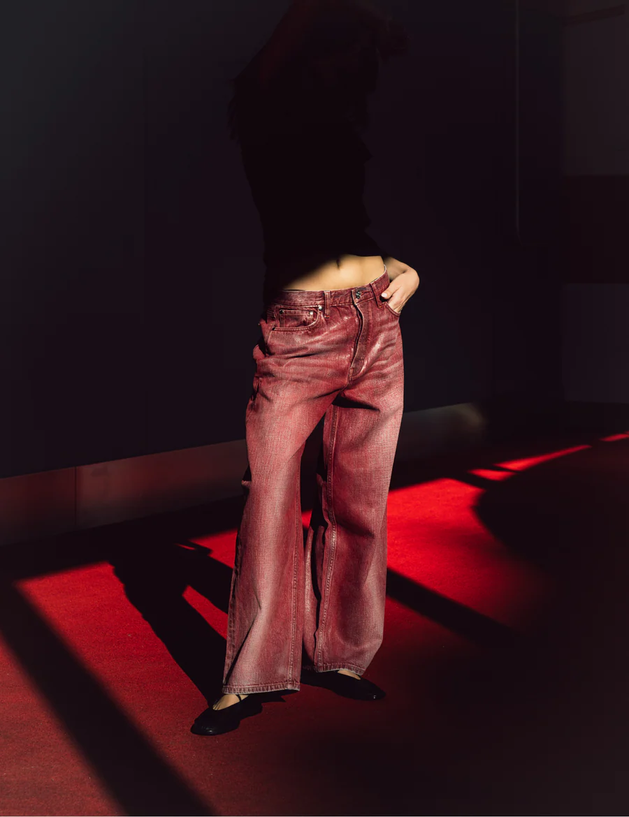
Red Bow House and why Fran became its symbolic icon

When I started leaning into the world of Red Bow House, I wasn’t trying to copy Fran Fine literally. I wasn’t trying to build a sitcom tribute brand.
But I was pulling from the same psychology that made her work.
A clear colour world. Repeated motifs. Strong feminine codes. A bit of cheek. A bit of theatricality. Something polished, but still playful. Something that feels like it has a point of view before you’ve even read a word.
That’s why she became such a symbolic icon for the brand.
Not because Red Bow House is about dressing like Fran Fine. It’s because she represents what I want women’s personal brands to do. Show up clearly. Hold attention. Feel unmistakable. Have wit, taste, and identity all at once.
The visuals I’ve built for Red Bow House lean heavily into that. Red, black, and white. Bows. Hearts. Checkerboard details. Clean framing. A strong visual stamp. Even the image set I created works like a cue system rather than a random mood board. It’s not just “pretty content.” It’s designed to be attributable. That’s a different thing entirely.
And there’s real psychology behind why that matters.
Research on processing fluency suggests that when something is easier for the brain to process, people tend to respond to it more positively. Repetition also matters. Psychologists have long described the mere exposure effect, which is the basic idea that repeated exposure can increase liking and familiarity. Kantar puts a commercial number on this by saying strong brand cues can increase brand saliency by 52%. So when I say people need stronger cues, I’m not talking about aesthetics for aesthetics’ sake. I’m talking about making the brand easier to recognise, easier to remember, and easier to choose.
Why recognisability matters more than just looking nice

This is the part I think people get wrong about personal branding. A lot of women assume the goal is to look polished, professional, or aesthetically pleasing. But that’s not really enough anymore. Plenty of brands look nice. Very few feel instantly attributable.
That’s why Fran Fine is such a useful reference point. She wasn’t just stylish. She was legible. Everything about her worked together so clearly that you recognised her before she even spoke. That’s what strong branding does too. It builds a world with enough consistency, personality, and point of view that people start to recognise it on sight.
That’s also what I wanted Red Bow House to hold. Not just beautiful visuals, but a clear identity. Something with strong cues, strong taste, and enough cohesion that it starts to feel unmistakable. The red, the bows, the contrast, the styling, the cheekiness, the femininity. None of it is random. It’s there to build a world people can actually remember.
If you want, I can now rewrite the entire post properly so it stays focused on personal branding, recognisability, and Red Bow House, with no video angle at all.
She knew exactly what role she played in the room
Another reason Fran worked is that she never felt diluted.
She walked into a wealthy Upper East Side house and didn’t suddenly become generic to fit it. She stayed specific. That tension is basically the entire magic of the show. The official series description still centres that dynamic, with Fran bringing warmth, honesty, and offbeat energy into a much more buttoned-up household.
That matters for branding too.
Because so many women start becoming more visible in business, then immediately start softening the very thing that made them interesting in the first place. They get more polished and somehow less clear. More present and somehow less memorable.
Fran didn’t do that.
She didn’t dissolve into the room. She coloured it in.
That’s what strong founder-led or personal branding does too. It doesn’t erase your difference to make you look more professional. It sharpens your difference so people understand why you’re worth paying attention to.
Even the behind-the-scenes stories prove the point
Part of what makes Fran such a rich branding example is that even the behind-the-scenes stories support the same thesis.
The concept for The Nanny came from a funny real-life moment Fran Drescher has retold more than once, involving Twiggy’s daughter complaining about uncomfortable shoes and Fran telling her to break them in. It was cheeky, practical, and not overly precious. Which is, honestly, very Fran.
There’s also the fashion legacy. Vogue documented Drescher rewearing the same Moschino vest from a 1994 episode decades later, because costume designer Brenda Cooper had held onto it all those years. And more recent reporting from People confirms that a lot of the wardrobe wasn’t preserved in some polished archive, but ended up scattered among collectors and fashion lovers, which almost feels perfect. Fran’s wardrobe didn’t disappear. It became mythology.
That’s what happens when visual identity is strong enough. It stops being content and starts becoming lore.
What I’m taking from Fran Fine into Red Bow House
For me, this isn’t really about writing a nostalgic love letter to a woman I grew up watching, although it is a little bit that too.
It’s about recognising why she stayed with me.
She stayed because she was specific.
She stayed because she repeated strong cues.
She stayed because her image and personality matched.
She stayed because the visual world around her supported her.
She stayed because she had a point of view.
She stayed because nothing about her felt watered down.
That’s what I want more women to understand about personal branding.
You don’t become memorable by trying to look polished in the most generic way possible... You become memorable by making it easy for people to recognise your world.
That’s what I’m doing with Red Bow House.
Not just making things look nice. not just building content that performs for five minutes... Actually designing recognisability.
So yes, Fran Fine has absolutely become part of the symbolic language of this brand.
She’s the reminder that being “too much” can actually be the strategy.
She’s the reminder that style is allowed to have a brain.
She’s the reminder that visibility works best when it has structure.
And she’s the reminder that sometimes the brands we remember most are the ones that never tried to become less themselves to be taken seriously.
The real takeaway
If you’re building a personal brand right now, especially if you’re showing up on video, here’s what I think matters most:
You need cues, consistency, you need a clear point of view... And you need to stop treating recognisability like it’s shallow.
It isn’t shallow!!
It’s memory.
It’s attribution.
It’s trust.
It’s psychology.
And when it’s done properly, it’s part of what makes people feel like they know you before they’ve even worked with you.
Fran Fine understood that instinctively.
I’m just giving it a branding name.
Red Bow House is a product of ReWorded, fine tuned for women who are their own personal brand or the face of a founder led business.


Comments